 |
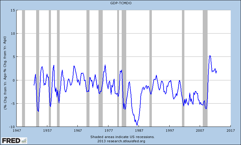
Difference in the year-over-year change between GDP and total debt.
|
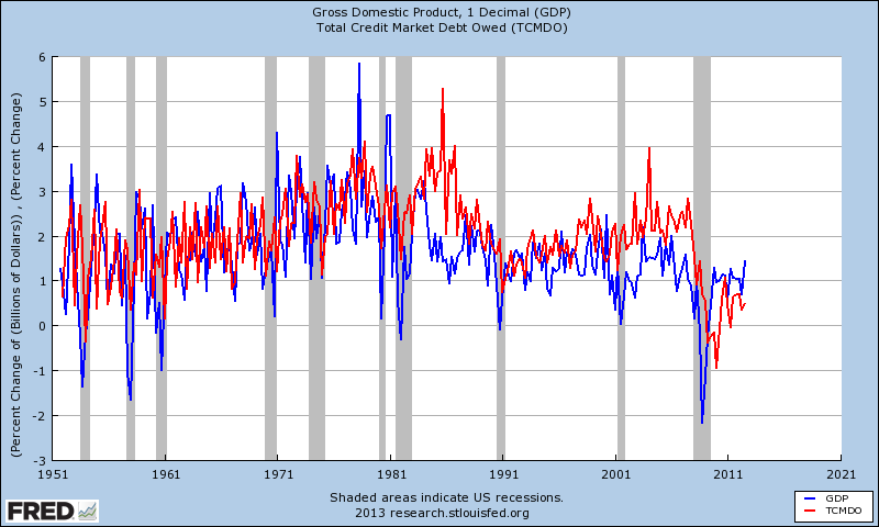 |
Quarterly change of GDP and total debt.
|
What happened there? Baby boomers, the money (debt) market, double dip recession, Reaganomics, OPEC, Ninja Turtles? In the first graph, from the start of the 1981 double dip recession to the end of the most recent recession, only once did GDP ever outpace TCMDO on an annual basis. Think about that...ok, done thinking?
Could it be that we are paying for an irrational reliance on debt over the past 30 years, otherwise known as a balance sheet recession?
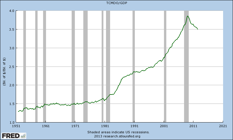 |
TCMDO/GDP
|
Excellent analysis of the first graph. I missed it completely. It was good that you put your observation into words!
ReplyDeleteOn your 3rd graph there is a flat spot from 1961 to 1981 give or take. Looks like a very slow increase in debt, compared to the increase of GDP. But things are not what they seem.
The flat spot corresponds to the Great Inflation (1965-1984 or so). The curve is affected by the inflation.
Note that GDP is a "flow" but TCMDO is a "stock". (GDP starts again from zero every year, but debt just accumulates.)
Because there are numbers from many years in the debt total, debt cannot be adjusted for inflation the same way GDP is. With two different calculations for inflation adjustment, the graph of real-over-real looks quite different from the graph of nominal-over-nominal.
http://newarthurianeconomics.blogspot.com/2012/06/by-numbers-2-history-is-different.html
Art,
ReplyDeleteGood point about price levels; I suppose this is why people make a case for 'inflating away the debt', or at least bringing net interest payments down to a decent % of GDP. Couple the inflation with the high interest rates of the late-1970s and early 1980s and the first large uptick in debt accumulation makes sense.