Wednesday, January 30, 2013

GDP Breakdown: Net Exports

It's been a while and I have put this off for long enough, but anyway, here is the final series of the GDP breakdown: net exports.  Net exports are defined as the imbalance in international trade: exports minus imports.
Imports (blue); exports (red); net exports (green).
Net exports as percent GDP. Net exports are negative so they take away from GDP.
Imports (red) and exports (blue) each as a percent GDP.
In the late 1980s, net exports began to contract.  This corresponds to the positive Saudi oil shock - when Saudi Arabia produced enough oil to cause a 40% drop in oil prices over a 3 month period.

As you may know, China is the largest source of imports in the US, and US oil imports account for the largest component of imports.  Because of the trade deficit, sooner or later, all those US dollars make their way to dollar denominated assets - either in Europe and eventually in the US.
 
These two factors, China imports and oil imports, account for the bulk of the US trade deficit.  Volatility in China, as Michael Pettis sees it, is confined to two scenarios: slow growth with high commodity prices, or fast growth with low commodity prices.  These scenarios will affect the US economy and its trade balance.  Inevitably, as Pettis states, protectionism becomes an issue.
 

Monday, January 28, 2013

Stagreflation?

With the fiscal cliffs of insanity and the debt ceiling circus finished (for now), government spending should continue to hold steady as it has since 2010.  This will be quite an austere measure in light of a recently stagnant unemployment rate.
Year-over-year percent change in federal government expenditures (blue) and federal government debt (red)
Unemployment rate remains at about 7.8%.
The Federal Reserve wants a 6.5% unemployment rate.  Looking at past recessions marred by high oil prices, I don't see the justification for 6.5% - at least within the next two years.  Are higher oil prices going to create enough inflation to move the unemployment rate lower?  Or might oil prices decline?
Inflation for consumer prices.
During the recession, asset (debt) prices and oil prices plummeted.  However,  oil prices have recovered and taken off to new heights (on an annual basis), whereas the central bank is attempting to reflate asset prices.

I have put together a graph which I believe helps illustrate some of the similarities between the 1970s stagflation and what I see as today's stagreflation - high stagnant unemployment due to central bank reflation of asset prices.  The chart is oversimplified and exaggerates certain events, but I hope it illustrates the greater concept of capital flow.
Unemployment shocks since the non-gold petrodollar flow.
 I think in both cases (late-1970s and mid-2000s), rising inflation was due to the petrodollar flows - which increased in volume due to the rising price of oil.  In the latter case, a small recycling of trade dollars from China might also be responsible, but I think Chinadollars were not as significant.   In the 1970s, high unemployment was blamed on high inflation.  This time around I think we are going through a type of reflation in which the central bank is inflating asset prices back to their former hyperinflated prices.
 

Friday, January 25, 2013

The Balance Sheet Recession

Debt to equity; this is what I came up with: the graph illustrates the jump in the ratio due to the overvaluation of debt (as an asset).  As I see it, debt is an asset (traded like a commodity), but (as Minsky said) credit is money.
The balance sheet ratio of debt to equity for the US: total credit market debt, and home owner and corporate equity.
To get back to pre-balance sheet bubble levels, the US must paydown its debt until debt:equity is roughly 1.5.
 
Richard Koo gives a brief review of what is a balance sheet recession.

Thursday, January 24, 2013

Elderly Caretakers

Elderly caretakers - from retirement home caretakers to hospital staff and everyone else - will be expected to take care of the stock market.  Someone has to buy the stocks being sold off by the elderly (so they may fund their retirement, if they have stocks).
 
Employment level of 25-54 years old divided by the not-employed civilian population of 55+ years old (blue); employment level of 25-54 years old divided by the civilian population of 55+ years old (red).
Not only will there be not be flying cars in the future but there may not be as many people to buy stocks in the future.  Which one has you more disappointed?

Tuesday, January 22, 2013

Employment Level

FRED added some new data sets to its employment series - employment levels by age range.  Let's take a look.

The Journey So Far
Employment level by age range.
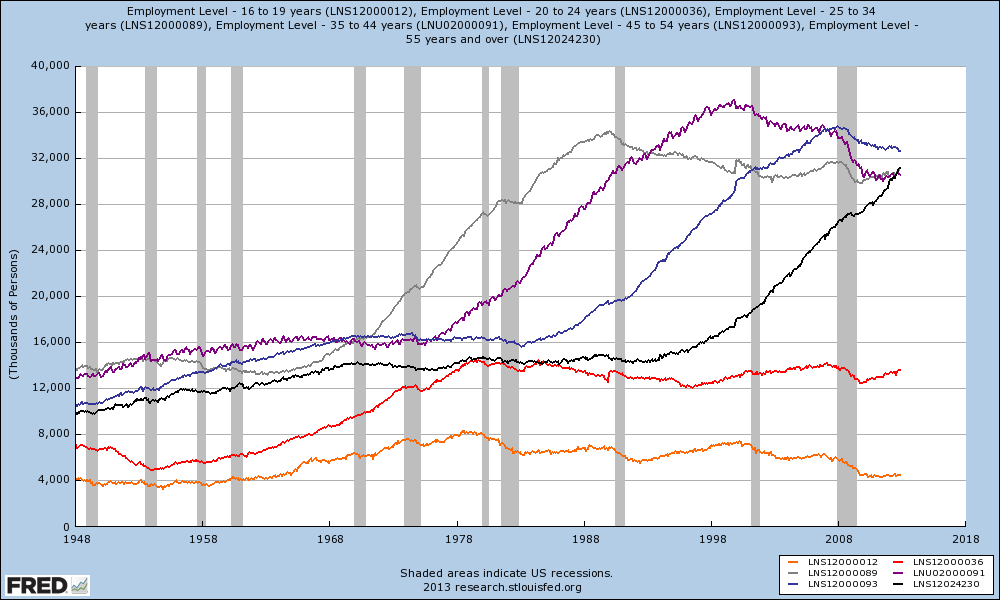
Graph #1: Employment Levels by Age - 55+ (black); 45-54 (blue); 35-44 (purple); 25-34 (gray); 20-24 (red); 16-19 (orange).
100% stacked graph showing the overall contribution to employment by age range.
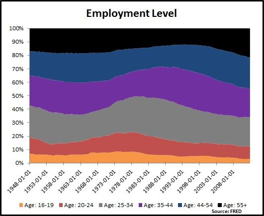
Graph #2: Employment Levels by Age - 55+ (black); 45-54 (blue); 35-44 (purple); 25-34 (gray); 20-24 (red); 16-19 (orange).
Apparent Trends
It could be me but, in the first graph, I thought I saw a trend.  So, below is a table with data for what I identify as pivots (a significant increase in employment level) and peaks.
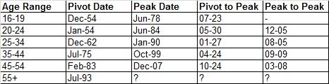
Table #1: Pivot and peak dates for each age range; pivot to peak defines the difference in months-years for a given range (7-23 is seven months and 23 years; 12-05 is twelve months and 5 years or 6 years) ; peak to peak defines months-years for succession of peaks.
Look at the trends in the 'pivot to peak' and 'peak to peak'.  55+ employment should peak somewhere between Oct-14 and Jan-18.  Averaging between the two roughly brings about a date of June-15, which is when I suspect short-term interest rates (Fed Funds) will begin their first significant increase since the beginning of quantitative easing.

The Draw Down 
I do not know when the 55+ employment level will peak so soon.  I do think fiscal policy could affect the peak date.  For instance, if the Medicare eligibility age were changed, or the Social Security eligibility age changed.  The 55+ range is technically open ended but the consensus is that people begin to retire around 60-65; this could change based on economic perception and fiscal policy.

But, as the boomers retire, they will drawdown their pensions.  This should drive down stock prices and drive up bond prices (drive down interest rates); the need for boomers to maintain pension reserves could force the federal government to increase its debt level.  I think this is similar to what happened in Japan, in which the government debt to GDP ratio has taken off to over 200% since the collapse of a very large late-1980s housing and stock market bubble.
Graph #3: Japan - Gross government debt as percent GDP (purple); Nikkei 225 (blue)

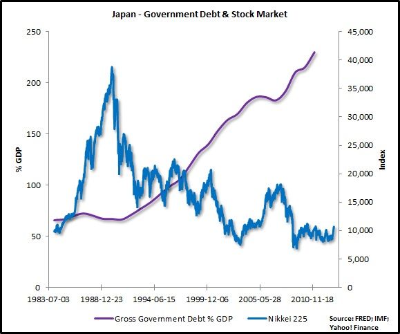
When the boomers draw down their pensions/mutual funds, they will likely be drawing out of equities first. The logical shift is from equities to bonds (the safer bet).  I think this would apply to all investors, both small and large, individual and institutional.
Graph #4: Japan - Nikkei 225 (blue); short-term government debt interest rate (green); unemployment (red)

That logic challenges the alleged bond (p.14) bubble some people say we are in (or not).  Enough of what I think,  Harry Dent says that we are about to hit the demographic cliff:
 
How many crashes have we seen in the last ten years or so? 2000, 2002 – bubble, crash. 2007 – bubble, crash. We're getting a bubble and crash every four or five years.
This is what we have when you go over a demographic cliff. Remember Japan – Japan went over the demographic cliff. Peak in baby boom spending, peak real estate boom.
They had a bust. Guess what? 22 years later, real estate is still down over 60 percent, still drifting down. Stocks are down nearly 80 percent, not that far off their lows. They keep bubbling up and then going down to new lows.
This is the new normal, given that baby boomers are aging and the next generation is not only not in the workforce yet, largely, but they're not as large when they do [enter]. So, we're never going to see real estate prices at these levels again, and we're not going to see stocks at the level we saw in 2007 for a long time.
 

Sallie Mae Changes Their 2013 Outlook

Sallie Mae downgraded their 2013 earnings forecast.  Shockingly, they blame the downgrade on the bad economic conditions student loan debtors must deal with; student loan debtors have also become increasingly delinquent on their student debt payments:
NEWARK, Del. (AP) -- Sallie Mae reported Wednesday that its fourth-quarter profit fell as the student lender set aside more money for bad loans.
It also forecast 2013 earnings short of Wall Street expectations and its shares slipped in after-hours trading Wednesday on the news.
Sallie Mae, based in Newark, Del., has seen an increase in demand for private loans as higher education costs rise. But it has also suffered financially as the economy has hindered students' ability to repay their debts
The economy is hindering?
 
The prime time to pay back student loans, for young persons, is not only once a job has been found and a career established, but when other debts, bills and expenses can be managed with a well paying job.
Graph #1: Unemployment Rates - Age Range - 20-24 (blue); 25-34 (red).
Choosing to not make student loan payments should be the easiest decision facing a cash-strapped debtor.  Think about it, there is nothing for anyone to repossess.  The only property acquired from education are books (frequently sold at the end of each semester for beer) and intellectual property.  Hard to repossess the later.

Graph #2: Household 90+ days delinquency rates.  http://www.newyorkfed.org/householdcredit/


Employment prospects have become increasingly better for graduating students since 2009.  Hopefully, there are morals to be learnt from the recession, and our current depression.  Sallie Mae has not been immune, even prior to this most recent news.
Graph #3: The not so great recovery for Sallie Mae.
Fortunately for Sallie Mae, the 25+-years-old-with-a-bachelor's-degree demographic has a relatively low unemployment rate compared amongst the same age group with differing education levels.  However, income growth and debt growth can place undue hardship on student loan debtors.
Graph #4: Unemployment Rate - 25+ - bachelor's degree (blue); some college (red); high school graduate (green); no high school diploma (orange).
 

Sunday, January 20, 2013

Euro Area Production: Down

Non-construction production index.
Graph #1: Nonconstruction Production - Euro area (pink) and EU27 (black).
Construction index.
Graph #2: Construction - Euro area (pink) and EU27 (black).
Construction in Spain is up 10% year-over-year but construction is down in Portugal and Italy 18%.  I guess it is the euro area, not the US, which is experiencing the double dip recession.  I thought by now the US would too be in recession due to a recovery max-out, despite the latest round of monetary expansion.  I guess I was wrong.

Wednesday, January 16, 2013

Paul Krugman: It Is All In The Mind

Bill Moyers interviews Paul Krugman on lesser depression economics; how to end this depression and get us back to full employment.

Video at Moyer's website: http://billmoyers.com/segment/paul-krugman-on-recessions-and-recovery/
Video at Vidmeo: http://vimeo.com/57196229

Tuesday, January 15, 2013

PIIGS Unemployment

Greece's October unemployment rate was 26.8%; Spain's November unemployment rose to 26.6%; Italy, Ireland and Portugal's November unemployment rates either stayed the same or declined.
PIIGS unemployment rates.
Take a look at the population statistics over the same time period; Greece and Portugal have seen declines in population - Portugal's population is below its 2006 level.  Spain's and Ireland's populations have plateaued; Italy's population growth (it seems) has not been negatively affected by the recent recession.  There have been media stories over the past year of people leaving Greece, Portugal and Spain to find work - mainly young adults (whose demographic suffers from extreme unemployment).
PIIGS population. Source: Eurostat.
 

Monday, January 14, 2013

TCMDO vs GDP: Two More Graphs

How long would it take for GDP to equal TCMDO in the same year (assuming certain GDP growth rates)?
The data is arranged such that as of now it will take 126.6 years for GDP to equal current TCMDO at 1% GDP growth; 63.6 years at 2%; 42.6 years at 3%; 32.1 years at 4%.
It will take 126.6 years for GDP to equal the current level of total debt.  That's not to say it will take 126.6 years to pay off the total debt.

The next graph is a breakdown of total debt into private debt and associated government debt (federal, state and local, GSE and Agency associated debt).  The denominators are GDP; GDP-GRECPT (disposable GDP); GRECPT (taxes).
Total debt (black; LHS); private debt (blue; LHS); public debt (red; RHS)
 

Saturday, January 12, 2013

NOVA: Mind Over Matter

Some weekend entertainment (if you're not working).  The link below is to an episode of NOVA covering behavioral economics.  From 2010, it focuses on speculative bubbles with an emphasis on recent research - including commentary on the recent housing bubble.

http://www.pbs.org/wgbh/nova/body/mind-over-money.html

Thursday, January 10, 2013

TCMDO vs. GDP

Total debt vs. gross domestic product: two graphs
Difference in the year-over-year change between GDP and total debt.


Quarterly change of GDP and total debt.
What happened there?  Baby boomers, the money (debt) market, double dip recession, Reaganomics, OPEC, Ninja Turtles?  In the first graph, from the start of the 1981 double dip recession to the end of the most recent recession, only once did GDP ever outpace TCMDO on an annual basis.  Think about that...ok, done thinking?
 
Could it be that we are paying for an irrational reliance on debt over the past 30 years, otherwise known as a balance sheet recession?
TCMDO/GDP


Monday, January 7, 2013

Federal Tax on Corporate Income

Annual federal tax on corporate income.
Federal tax on corprate income
Tax divided by GDP.
Federal tax on corporate income as percent GDP.

Now for the year-over-year change federal corporate income tax.
Year-over-year change in federal tax on ccorporate income.
Tax divided by GDP YOY change.
Year-over-year change in federal tax on corporate income as percent GDP.

The last two graphs (below) show the relationship between federal corporate income tax and total federal tax, and corporate income tax and corporate income.
Federal corporate income tax divided by total federal tax.

Federal tax on corporate income divided by pre-tax corporate profits.

Thursday, January 3, 2013

Tuesday, January 1, 2013

Oil Supply Forecasts: Total, Exxon, IEA and EIA

Total
Total's chairman and chief executive, Chris de Margerie, forecast that world oil production will peak at 98 million barrels per day (mb/d).  He gave no date, but predicts a plateau at that level for some time (to pacify shareholder fears?).  He estimates an additional 1 to 3 million barrels per day of extra US tight oil production.
 
I do not know exactly what context de Margerie was speaking from, whether this was Chairman de Margerie or Chief Executive de Margerie.

Exxon
Exxon's Outlook For Energy 2013 forecasts that total liquids (all liquid hydrocarbons) supply will reach 113 mb/d by 2040, North America will be a net energy exporter by 2025, North America will be a net oil and oil based product exporter by 2030, and natural gas will overtake coal as the world's second largest energy source.


No peak or plateau, just a projection to 2040.  Projected peak for traditional crude oil plus the condensate has already occurred.


North America projection, and supply growth by world region.


Exxon's total energy forecast by energy source.


IEA
The International Energy Agency (IEA) is forecasting that the US will become the world's largest oil producer by 2020 (its energy renaissance), North America will become a net oil exporter by 2030, Iraq will account for 45% of oil production growth from now until 2035, and global total energy demand will rise by one-third of its present level by 2035 (60% due to China, India and the Middle East).  The IEA's World Energy Outlook 2012 is not free, but they do have a freely available executive summary and press presentation.


US oil and gas production forecasts.


IEA forecasts Iraq oil production and exports to nearly triple from now to 2035.


Global energy demand has been forecast to grow the fastest in China, India and the Middle East.

EIA
The Energy Information Administration (EIA) says that US oil output will increase by about 2.5 mb/d over the next 10 years - with almost all growth coming from tight oil.  The EIA will release its energy outlook in the spring of 2013, but it has put together an early release.

US oil production has been forecast to increase to 7.5 mb/d by 2019, according to the EIA.  Almost all production growth will come from tight oil.


EIA's oil price forecast.

In Summary
Some of the forecasts certainly are rosy, citing major increases in US unconventional oil production and a nearly 3-fold increase in Iraq oil production.  There is an economic justification for such forecasts: the price of oil remained low from 1986 until the early-2000s, discouraging large scale investment.  However, with higher prices producers will be encouraged to accept investment to help increase supply.

No rosy outlook for Saudi Arabia?
 

US production (yellow) from 1920 to present, along with its components: the PADDs.  The PADDs were created (designated) during WWII, so I am a bit surprised data only goes back to the early-1980s.


PADDs only.  The red line includes Texas, the yellow line includes North Dakota, and the green line includes Wyoming and Colorado - all major players in tight oil development and production.  The brown line's decline is driven by the North Slope's decline.


World oil production.

Other Links:
Future Production From U.S. shale or tight oil
IEA Oil Forecast Unrealistically High; Misses Diminishing Returns
A Tale of Two Forecasts