Tuesday, January 28, 2014

Libyan Oil Production

The most recent EIA data show declining oil production in Libya.  The EIA estimates about 1.1 million barrels per day of production from Libya in the 2Q of 2013.  This is about 0.8 million barrels less than its peak production in the 1Q of 2008 -- or a 43% decline.

Below is a chart of oil production form Venezuela, Iraq, Egypt and Libya since 2000.  I chose these countries because they have each gone through similar governmental change.  However, only Venezuela (2002), Iraq (2003) and Libya (2011) show major changes in oil production due to coup and war.


The Libyan government wants to resume production at some of its major oil fields where protesters have caused a massive delay in production.  Meanwhile militias want to export oil.  The Libyan government has warned rebel groups that it will take military action in the country's eastern ports if such actions continue.

Similarly in Iraq, the northern government in Kurdistan is shipping oil to Turkey without the explicit permission of the Iraqi national government, so far.  Turkey promises to put the oil in storage until approval is given.  Ok.

Monday, January 13, 2014

Taper Backlash: Unintended Consequences

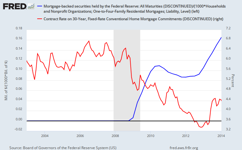
The Federal Reserve increased its mortgage-backed securities buying program in October 2012.  From the start of 2013 to present, the 30-year conventional mortgage rate has risen from 3.35% to its current level at 4.4%.  Is this what the Federal Reserve was expecting to happen?

Mortgage-backed securities held by the Federal Reserve divide by housing debt (blue; left); 30-year conventional mortgage rate (red; right).

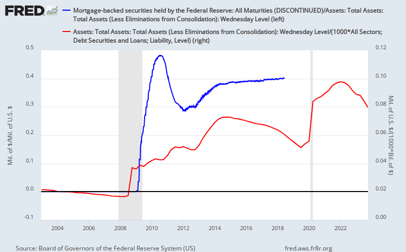
Mortgage-backed securities in October 2013 comprised 30% of the Federal Reserves total assets - today such assets comprise 37% of the Federal Reserve's total assets.  The Federal Reserve's share in the ownership of US debt continues to climb - now over 6% - while loan growth at US banks continues to decline (though still growing...just not as fast)

Yet in the meantime, the Federal Reserve's top official (for the next couple weeks) Ben Bernanke continues to warn everyone about there being too little inflation within the economy.  Rising interest rates and declining price levels correlate well with each other, but the Federal Reserve's QE program to me looks like an interest rate lowering program.

So why then has the 30-year conventional mortgage rate been rising since the start of the latest QE?  I think such a question can only be answered by looking at the housing markets and which interest rates the Federal Reserve controls, in a later post.

Mortgage-backed securities as percent of assets held by the Federal Reserve (blue; left); Federal Reserve assets as percent of total US debt (red; right).

Tuesday, January 7, 2014

Taper Backlash

The Federal Reserve will cut its bond buying from $85 billion per month to $75 billion per month.  I think I found what is going to be my chart-to-track for the next few months: 10-year treasury vs. gold.

Since 12/18/2013: 10-year treasury (blue; left) and gold price (red; right).
From what I can gather, because of the taper, bond prices should drop -- forcing interest rates to rise -- and gold prices should drop as higher-yielding bonds become more attractive to investors.  Will markets (investors) react accordingly (as they should (predicted))?  The rule-of-thumb seems to be that as demand declines so will prices -- a proportional relationship.  What if supply declines?

Past 5-years: Federal government debt (credit instrument liabilities) (green; left) and federal government deficit (black; right).
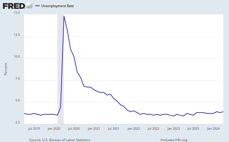
The federal deficit had been shrinking until the most recent recorded quarter -- Q3 2013.  Federal government bonds (treasuries) are not the only bonds being purchased by the Federal Reserve -- I will cover the MBS later.  Though for now, I am going to leave by putting the final focus on the Federal Reserve's guiding metric: the unemployment rate.

Unemployment rate.

Friday, January 3, 2014

Initial Claims

Initial claims are flattening out around 340,000.  Although claims have been trending downward since the end of the recession, they had previously flattened out for much of 2012.  It kind of goes against the unemployment rate trend -- moving downward, currently at 7.0%.

Past 5-years: 4-week moving average (blue; left) and weekly (red; left) unemployment claims, and the unemployment rate (black; right).
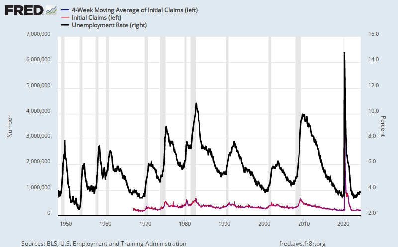
It kind of goes against the historical data which show correlation between initial claims and the unemployment rate; however, the unemployment data lag the initial claims data.  There are also periods where initial claims quickly shot upward with no such correlation in the unemployment rate (i.e. late-2005, late-2012).  Of course, that is long-term correlation on a decades-wide scale -- the above chart points to a narrower range of about a half-year.

Since 1967: 4-week moving average (blue; left) and weekly (red; left) unemployment claims, and the unemployment rate (black; right).